

Consistent use of approved font choices — and understanding how and when to use them — ensures that university communications remain recognizable and cohesive across print and digital materials.
Typography for print
Typography plays an important role in how audiences read and understand printed materials.
Accessibility considerations should always guide typography choices in design, even in print if you plan to mix fonts. Sans serif typefaces are generally clearer and easier to read for many audiences, particularly in body copy.
For this reason, in print materials, you should prioritize sans serif fonts for body text, while serif typefaces may be used selectively for headlines or stylistic emphasis in areas for quotes, etc.
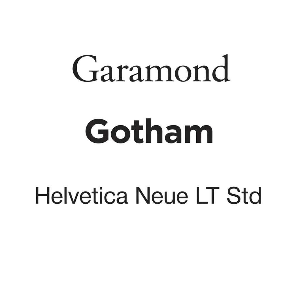
Primary approved typefaces for print
The following typefaces are approved for use in university print materials:
- Serif:
- Garamond (all fonts and weights)
- Sans serif:
- Gotham (all fonts and weights)
- Helvetica Neue LT Std (all fonts and weights)
These typefaces can be used in an array of combinations and weights to give the illusion of more variety.
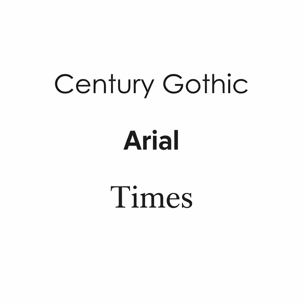
Secondary approved typefaces for print
Sometimes the typeface (or font) files we provide won’t work on your computer. In that case, these standard system fonts are acceptable replacements:
- Serif:
- Times (all fonts and weights)
- Sans serif:
- Century Gothic (all fonts and weights)
- Arial (all fonts and weights)
Replacement typefaces are mainly for body text or header/footer text. These typefaces should not be used for large displays such as posters, banners, etc.
Typography for digital materials
Typography also plays an important role in the readability of digital content. On screens, sans serif typefaces are generally easier to read and render more consistently across devices and browsers.
For accessibility and usability, body text in digital materials should use sans serif fonts, which help improve clarity and reduce visual strain for readers. Serif typefaces may be used sparingly for headlines or visual emphasis, but the majority of on-screen text should rely on clean, simple sans serif typography to ensure a clear and accessible reading experience.
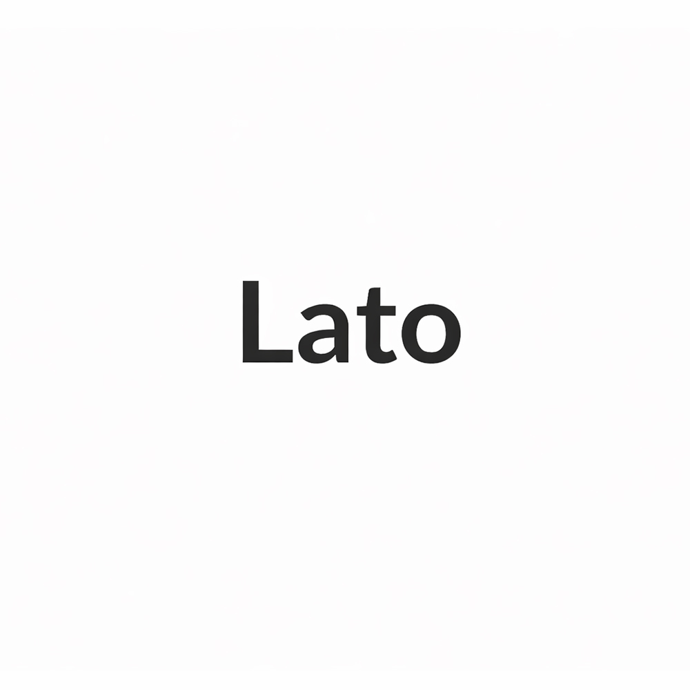
Typefaces for web & email
USM web editors should use the fonts available in WordPress patterns and templates.
If you are building a third-party website or using an email service provider (e.g., Mailchimp, Constant Contact, etc.), please use our approved font stack:
- Approved* digital font stack:
- Lato, Helvetica, Arial, sans-serif
* We are planning future website projects with the intention of launching new typefaces.